Windows 11 file manager is getting a new design and new features
Microsoft is preparing to launch a major update of File Explorer (Explorer) for the Windows 11 operating system. This was reported by the well-known thematic resource WindowsCentral, which managed to get its hands on the internal layouts of the updated application.

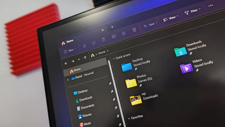
File Explorer is expected to get a refresh in several key areas, a refreshed design, an improved touchscreen experience, and new features that improve integration with OneDrive and Microsoft 365.
The biggest change will be a modern user interface that will be in line with the rest of the operating system. For example, Microsoft is updating the search field, window decoration, title bars, and buttons, including the home button. Overall, File Explorer will get a cleaner and more intuitive design. Among other things, the new interface will simplify the use of tabs.

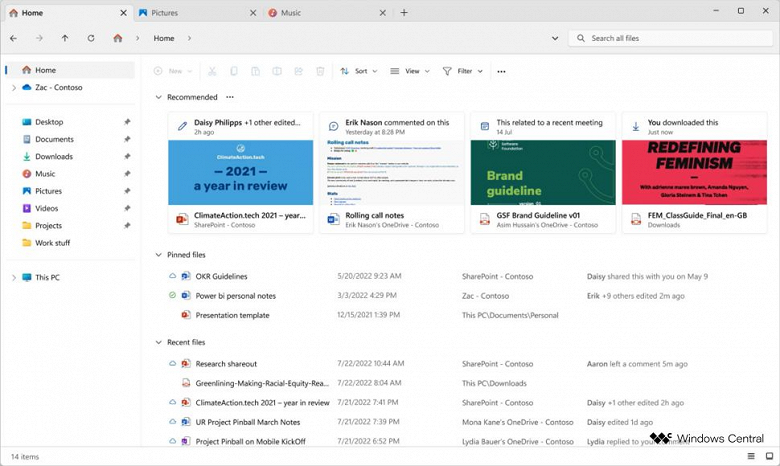
Among the functional innovations, the most significant will be the redesigned home page, now tightly integrated with Microsoft 365. At the top there will be a ribbon of “recommended” files, which will be represented by enlarged thumbnails.
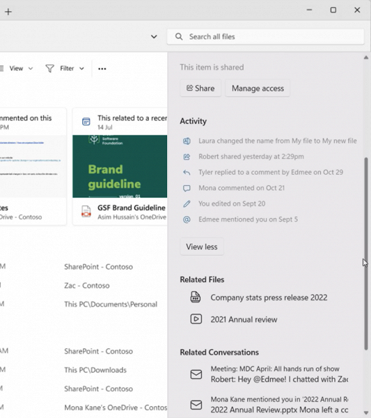
Deeper integration with Microsoft 365 means users can see email threads and recent comments on files that are shared through the cloud with colleagues or attached to email. This information will be visible at a glance.

There will also be more options for viewing photos in the “Explorer” through the new “Gallery”. If you hover over the photo, an enlarged preview will appear. In addition, tags will be added to organize and classify files using keywords and color labels, similar to what macOS offers in the Finder app.
As noted in WindowsCentral, if all these plans come true, then this will be the most significant update to File Explorer since Windows 8, released more than 10 years ago.


