While the new route mapping is being tested selectively
Google has begun testing a new route display mode on Google Maps, which has sparked controversy on the web.

A controversial innovation is being tested in Google Maps. Not everyone liked the redesigned route interface
Initially, members of the XDA Developers community of mobile developers drew attention to the new interface. The note describes the interface as “fresher,” “cleaner,” and easier to understand. However, not everyone agreed with this point of view.
For example, according to the thematic resource AndroidPolice, Google should not try to “fix what is not broken,” and the authors perceived the new interface as “not so intuitive.”
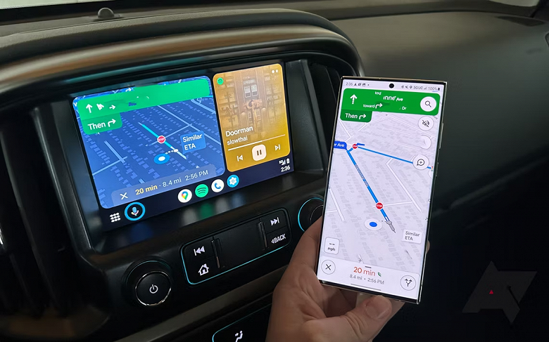
As we can see, the overloaded panel at the top has been removed in the interface, replaced by a simplified floating panel. Various movement types are now visible at the bottom of the screen, and the “Send to” option is also found there.
The new bottom panel was the main criticism. Whereas earlier, the expected arrival time for different movement methods could be easily seen and compared in a neat line above, now the user will have to use scrolling.
At the moment, the change is at the stage of selective testing, and it is not yet clear whether Google will decide to implement it for all users or not.


