Last updated on December 8th, 2022 at 03:13 pm
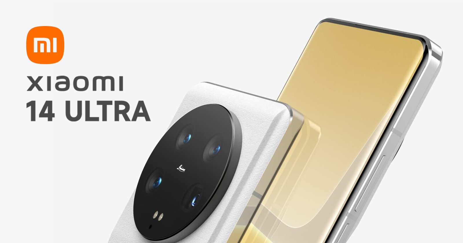
Xiaomi has unveiled an updated logo. The changes are small, but a lot of effort was spent on them
Today, the Chinese company Xiaomi has announced its first foldable smartphone Mi Mix Fold . However, it was not the only novelty presented today. The company spent about 20 minutes describing the process of redesigning the corporate logo, which remains much the same as it was before.

Xiaomi has rounded the corners of the logo, making its shape softer. However, the company’s CEO Lei Jun said that despite the slight differences, the company not only changed the shape of its logo to a more rounded one, but also changed the inner spirit and mentality of the brand. The head of the company noted that the shape of the new logo can be described using mathematical equations, although this is typical for most geometric shapes. He also said that the logo redesign process began in 2017. During the presentation, logo options were shown that were rejected over the four years before finding the perfect shape.
Lei Jun explained that the company’s new logo is part of a larger overhaul of Xiaomi’s branding, led by renowned Japanese designer Kenya Hara. Probably, in the coming years we will be able to see new incarnations of his vision.


