The PlayStation 5 was originally much larger, the console designer said in a large interview
On the eve of Sony’s June Future of Games event, Yujin Morisawa was very worried. He, as Senior Art Director, was responsible for the development of the PS5, which was to be presented to the public for the first time. “I was under a lot of pressure, ” he said. He spoke about this and other features of the development of an ambiguous console design in a recent interview.
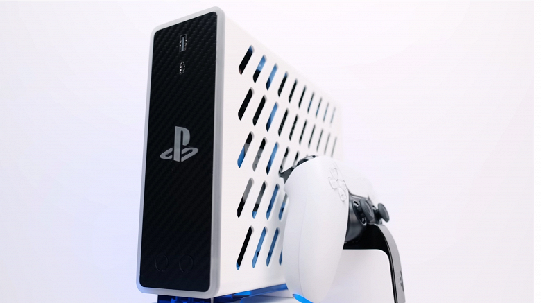
The PS5’s design is radically different from previous PlayStation consoles with its vibrant white and black color scheme and blue lighting elements. This sent the internet into excitement: Twitter and Reddit users couldn’t help but laugh at the PS5’s similarities to routers, humidifiers, and even Barad-Dur, to be crowned with the Eye of Sauron. But these humorous comparisons did not bother Mr. Morisava but encouraged him.
“When you design something, you want it to be convenient. Sometimes the system looks like a plant, an animal, or some kind of object. I think it’s nicer than something strange or never seen before, ”the designer said.
As more information about the system was announced, something else became apparent. The PlayStation 5 turned out to be huge, significantly larger than the Xbox Series X or any previous Sony game console. But initially, Morisawa believed that it needed to be done even more. “When I started painting, it was much larger, although I didn’t know what the engineers were going to do, ” he said. “ It’s funny that the engineers actually told me it was too big. So I had to reduce it a little compared to the first picture. ” Eugene Morisawa met with The Washington Post to discuss his inspiration and PS5 development process. Here is the full interview.
Is there a specific word or phrase you use to describe the PS 5 console’s design?
– I tried to create an invisible mass between the player and the mechanical design. This is how I describe it. Something in between hardware and a player, embodied in the design.
– What inspired you in aesthetics?
– I came up with the term “five dimensions”. If you think about the environment offered by the console, then we are talking about a jump into a parallel world, in time or space. This is a PlayStation 5, so five dimensions do fit.
– When the console was introduced, there was a lot of joking comparisons to household items. How did you react to these memes?
– I think it’s good. When you design something, you want it to be convenient. Sometimes the system looks like a plant, like an animal, or some kind of object. I think it’s nicer than something strange or never seen before. I think a balance is needed. I guess the meme situation was funny. I was not offended by anything. I really like the way people play with the system. I don’t think this is bad. I think this is a good sign.
– Do you think “divisive” is a good description of the public reaction to the PS 5 demonstration?
– Well, this is what I want to achieve all the time, so I think it was a good reaction. If you look at something really new, you react and ask, “What is this?” You don’t know how to react to this. When you look closely, you really see some familiar structure. You kind of understand it after. This is really something different from what we have proposed before. But the base has always been a square shape and circles. PS5 is accurate in size, so it feels comfortable when a person is looking at this object in reality.
– PS 5 looks very different from the previous four PlayStation consoles. It was a very bold step forward. Can you tell us how you came to this decision?
“I wanted to build a design concept around the player’s energy and emotion and try to match that. I think the design expresses the spirit of a powerful car. The system may look organic, but all lines and dimensions are very accurate measurements.
– PS 5 is physically slightly larger than other PlayStation consoles, as well as your competitors. When you were designing the console, did you feel the need to find ways to make it smaller?
“ At first I didn’t know what to expect. I knew that it would be bigger because I had an idea how much power would be contained in it – I understood how much air would have to be vented and how much space would be needed for a radiator. When I started painting, it was much larger, although I didn’t know what the engineers were going to do. It’s funny that the engineers actually told me it was too big. So I had to reduce it a little compared to the first picture. We wanted to make it a lot smaller, but now it’s a perfect size. If I made it thinner, the airflow would decrease. It would make it difficult to enjoy the game. As for the format, I traced the inner components with perfect lines and tried to find the perfect size.
How did the internal components of the car dictate the design of the console?
– At first, I didn’t know what interesting solutions would form the basis of the system. I started thinking about the concept of design as an environment. But I started talking to the engineers about how they are going to provide the kind of power we need to offer players. I used to design personal computers and other electronics that also solve heat problems, so I started thinking about the airflow inside the car. I really didn’t want to get in the way of the internal components, but tried to maximize the space on the inside, and also tried to create the necessary and optional forms on the outside. It was a difficult decision at first. Should the console look like the successor to the PlayStation 4, or should we go beyond what we designed before? We decided to go further because everyone on the team was trying to achieve something more than we had.
– Do you prefer vertical or horizontal orientation from aesthetic and other points of view?
– I don’t have a PS5 yet [laughs]. If I could get my hands on the system now, I personally would prefer both. I designed both [standard and digital PlayStation 5], so I’ll buy both and place one vertically and the other horizontally.
– One of the hallmarks of the PlayStation brand is the shape of the buttons on the front and the colors associated with them. This seems to be the first time that each of the buttons on the front side did not have green, red, blue, and pink colors.
– Yes, except for special editions, we have always used these colors. In PlayStation 5, we tried to remove what was already there. I wanted to simplify the style and make it versatile. The figure template already shows which button we are talking about. In reality, the colors for the buttons are optional. So I made them solid.
– Are there any small design details that you really like? For example, a pattern has already been found on the controller with characteristic PlayStation shapes.
– Yes, when I started developing the PlayStation 5, I told the designers that we have to design everything we work on. Up to texture, color, or small details. We need to spend time on this. I came up with this texture to hide shapes or patterns in it. I intended to make something like an easter egg that players could find after buying a PlayStation 5. But people have already found out about the secret, so I can talk about it. The texture must be functional. It helps to hold the controller in your hands. And for the console, a different lighting effect is created to match the shape of the design. The shapes are designed to reflect the energy and emotions of users. It’s like clumps of microorganisms create larger structures. What I meant to say is that the player’s energy, strength, and emotion combine to create this shape. This is how this texture was invented.
– Were there any other similar hidden details?
– You will have to find out about it yourself.
