New popup window leads to frequent re-downloads
Google has released an update for its proprietary browser, which makes a small change to the Chrome interface, designed to simplify the process of interacting with previously downloaded files. Users did not find this change useful, and they began to complain intensely about the innovation on the network.

We are talking about moving the downloads panel. Previously, it was located at the bottom of the Chrome window. As Google notes, such a panel brought three problems at once: it took up precious space on the screen, did not disappear automatically, was obsolete, and did not fit in style with the rest of the browser interface.

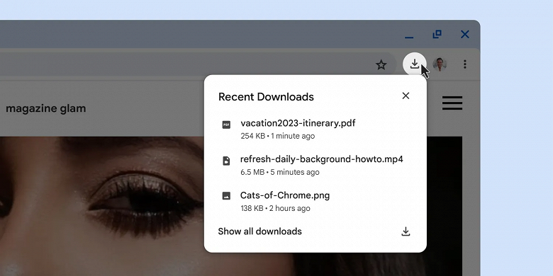
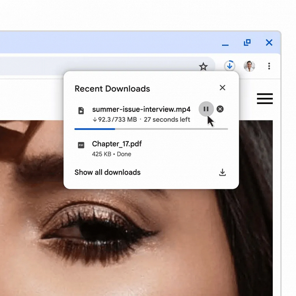
To address these issues, Google has hidden information about downloaded files under a small button to the right of the address/search bar. By clicking on the button, the user will see a drop-down list of recent downloads. With active loading, the user will see a clear animation, and upon its completion, a small pop-up window, which, in principle, can be turned off.
The updated Google Chrome interface was criticized by users.

As already noted, not everyone liked the innovation and users criticized the removal of the “loading panel”.

According to complaints, the old panel provided a clear view of the progress of the download and was more convenient. It is difficult for users to adjust to the new interface, which leads to repeated downloads of the same files. Those affected perceive the company’s recent decision as unnecessary and unreasonable. Here is one example of a review:
Hello, today my Google Chrome updated this downloads icon and every time I save something, a window pops up to this icon and shows a recent download. It’s so annoying!
Fortunately, there is an easy way to turn off the innovation if necessary. At chrome://flags, you need to find a flag called New Download Bubble and disable it.


